I really love art by Martin Tomsky that is created with layers. I wanted to try something similar.
The source image:
 Tui by Matt Binns [source]
The goal:
 These are examples from previous attempts
Step 1: Preprocess
First we take the source image and use cut out the subject and adjust the colour to be very vibrant.
Note: Copy Subject in the photos app and New From Clipboard in macOS preview are useful here.
 Increased saturation and sharpness, also balanced the colours for easier tracing
Step 2: Import into Inkscape and Trace Bitmap
Use Path > Trace Bitmap on the image selecting Multicolor using Colors as detection mode.

Note: the _Stack_ feature is useless in my experience.

This will create 4 paths for the colors in the image:

 Each of the paths that are created
Sort the paths smallest to biggest (just by looking) so the biggest paths are at the bottom. Also name them:

Step 3: Join Paths
Each layer we have must support the layer above it, however at the moment each layer is distinct. We need to join them in a way that each layer includes the layer above it as well.
Select paths 1 2 3 4:

Duplicate them:

Then Path > Union:

The new path (handily also called 1) should replace the old path.

Do the above steps (duplicate, union, replace) for the paths 2 3 4 and 3 4.
Now the image is the same as before but the paths are more layered.

Step 4: Exclusion
Currently we have paths that when added together make an image. We want paths that when subtracted from one another they make the same image. This involved some Exclusions and reversing orders.
Draw a border a little bigger than the image and use Path > Object to Path to make it a path. Place the border over the image and add it to the group.

Duplicate the border and path 1 then use Path > Exclusion to cut that path out. Duplicate and exclude for each layer.
At the end of this you should have 5 paths:

You will have to reorder the layers to get an image:

The colours are wrong in this image. Before we added the paths together to generate the image, now we subtract them. If you make each path the colour of the path above it, and make the top layer white (because it is the background) it should fix the image:
 Fixed by changing the colours
Step 5: Simplify
The paths at the moment can be cut, but they are inefficient. We can simplify these paths pretty easily:
- select a path
Path > Break Apart- select all paths (that are not the large rectangle)
Path > Union- select the 2 remaining paths
Path > Exclusion
This removes a lot of useless nodes:
 Before simplification-> After simplification.
You could probably simplify a few steps earlier, or do it a different way.
Step 6: Laser Cut
It takes about 8 minutes to cut these paths:

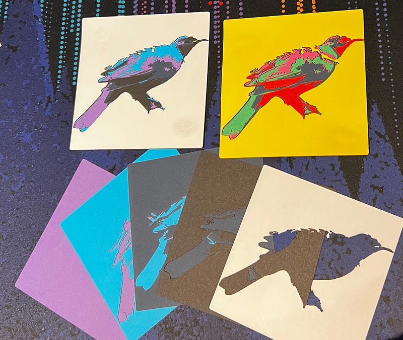
Finished Product
The final product looks like:
 140mm x 100mm print on Laserbox
Its layers look like:

Thoughts
The final result looks fine, but it resembles a crow more than a Tui. This was a quick experiment, but I would like to try and improve the final product.
A few things that I would like to try:
- Spend more time simplifying and optimising the paths. I think I could get much better results and remove unneeded detail in steps 1 and 2.
- Bigger images and more layers should improve detail.
- Try different materials like wood or acrylic.
- Etch some detail onto the card as well as cutting.
- Experiment with more colours and shades. I replaced the dark blue with a purple and I think it looks better:
 If you have any suggestions or improvements to this process please let me know. I am sure there are better ways of doing this kind of work out there.